


Rupa Frontline, India’s largest selling inner wear brand, has recently revamped its new brand identity with the launch of its new logo, which aims to capture the sensibilities of the millennials. The new logo repositions brand frontline as a young and fashion-forward brand that aspires to make the lives of its consumers very comfortable.
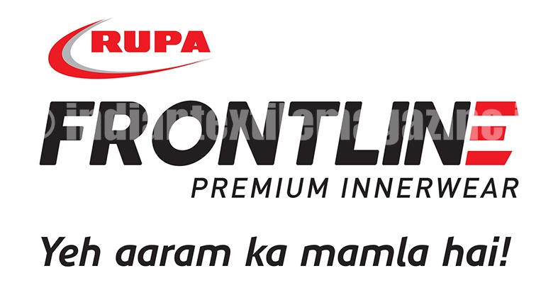
The new frontline logo depicts progress or ‘being ahead’. The slant in the logo illustrates progress and the way forward. The letter ‘E’ showcases an aerial view of a phalanx – the frontward stripes are significant of the fact that the brand is moving ahead.
The earlier logo basically had a ‘hand written’ look to it, which was more like a signature. The new frontline logo is much more stylish and leverages the growth and expansion of the brand in India and abroad.
Frontline is one of the oldest brands in India that came into existence in 1985. Aided by huge market demand and brand following, the brand evolved into India’s leading lifestyle brand pioneering the national slogan, ‘Yeh Aaram Ka Mamla Hai!’
The new frontline brand logo deftly depicts the journey of the brand from being an innerwear tenderfoot to one of the most popular brands in the country. It truly reflects the brand’s beliefs and aspirations, and puts it straight in the league of the leading Gen-Next brands globally.
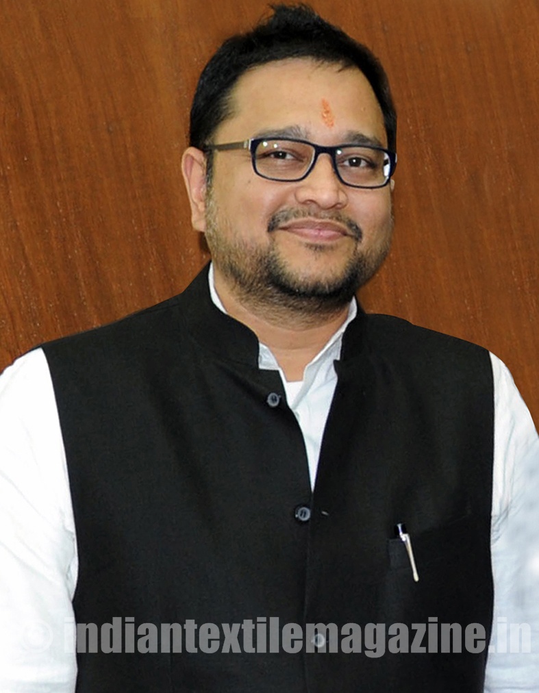
Announcing the launch of the new frontline logo, Mr. Mukesh Agarwal, Brand President, said: “I’m much excited to launch the new logo for Rupa Frontline. We’ve been working on the new logo for quite some time, as the brand has come a long way since its inception in 1985 and a new logo that represents the brand’s present outlook was absolutely necessary. Two decades ago, frontline was introduced as men’s innerwear brand. However, gradually it evolved into a lifestyle brand catering to the various needs of the consumers with superlative products known for its quality and price. The revamped logo efficiently projects the brand’s forward movement, while still retaining its authenticity and heritage.”
Frontline’s value proposition remains unaltered with the new logo launch. The brand stays put on its commitment to provide quality products and competitive pricing with a major focus on research and development, technological upgradation and exceptional customer service.